Wednesday, November 16, 2011

Carly's House~ Before & Afters

Carly bought a house!
Carly is my best buddy from college and when she called to tell me the news my wheels immediately started turning. She sent photos right away and WOW... I had my work cut out for me. The bones of the house were beautiful but the details added from the previous owner were super traditional and heavy. I know Carly's style and everything had to be changed on a (young girl that just bought a house by herself) budget!


Car's email from the beginning of the design process started like this...


"I'm a bit overwhelmed... I must say. I think sometimes I have good taste and that I should try to design something for myself and then I realize I need to stick with Environmental Education. : )"


Haha, don't worry Car... I got this! Love you.


master bedroom
Last weekend I went to visit and saw the house for the first time. I was nervous to see the outcome because everything was done super fast over email.
I loved it... I loved that she listened to everything I said, bought everything I told her to buy and most of all, that it looked like her!

note: I wanted to show the master bedroom first because it shows her style perfectly. We blended very clean lines with multiple textures, patterns and bold colors. 
When I introduced her to the decal sites she was in love!  This is one of the many throughout the house.

note: www.dalidecals.com and www.whatisblik.com
 are two of my favs!

This patterned Target chair sits next to the door to the MBR deck... perfect for her to crochet and see the woods in her backyard. 

First things first for the entire home. ALL moulding was to be painted a crisp and clean white.

tip: I used the color from the accent wall and carried it up to the tray ceiling to bring your eye up and create height.
 
 The very SCARY before photo of the Master bedroom
note: The moulding, tray ceiling, paint color... well everything, was just wrong!

                                                                                                               
guest room #1
The guest rooms are small and both needed daybeds. No one does a better looking daybed than West Elm.
The best part... she found it on Craiglist!

West Elm dresser
Target comforter and accent rug... 
Love the prints and patterns from Dwell Studio
Designer look for cheap!

 Another scary before photo of guest room #1
note: I made sure the chair rail moulding was pulled from this room.


guest room #2
I wanted her guests to feel comfortable and relaxed. I thought that giving the room these white accents would create a "spa like" feel and leave one feeling very "zen."

note: West Elm Pull-out Sofa and Nightstands
Target Dwell Studio Area Rug
Target lamps

Love the cable knit throw... so cozy!

The natural avocado colored walls surround the room. One of my favorite colorways... my own Master bedroom! 

Target dresser

Since Carly ALWAYS has guests, Jake (her thoughtful boyfriend) had this guest book made for her from Etsy as a birthday gift. The November birthday flower, Chrysanthemum, is on the cover! Guests can sign it and write a message about their stay in Gettysburg. So cute! 


We love it!

Before photo guest bedroom #2... Ohhh, heavens! 
All I have to say about that!


entryway
This was a fun surprise when I walked in... Car and her new love of decals added these bare trees. 

Looks awesome!
                                            
                                                                                                                                 home office
When you first walk into the home this dining room was on the right. Carly wanted it to be her home office.
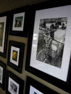
 My first thought... GALLERY WALL!

note: She has traveled to some of the most amazing places in the world... she can display her favorite shots here. 


I chose a taupe color similar to the one in my home office but a bit warmer. Love the way the photos "pop" and really make a statement.

Area Rug: Home Decorators Collection

Personal touches... beautiful!


 side note:
I loved visiting Gettysburg... the little square, driving through the battlefields and stopping at the barn.


 photo: Carly calling in her gorgeous horse, Roe, from the pasture. 

A few shakes from the food bucket and they slowly made their way in... Roe is still hanging out in the back ground. 

Loved this old barn... so beautiful out there!

If you live out-of-town and would like online design consulting email me at: mmmdesignsinteriors@gmail.com

Super easy and a lot of fun... just send pics and dimensions.

Have a good one!


Melis

No comments: